Table of Contents
<html>
<a href=“http://lucianofsamosata.info/wiki/doku.php?id=submission_page”><img src=“http://lucianofsamosata.info/images/contact.png” /></a>
</html>
Gnome 3
<html><p xmlns:dct=“http://purl.org/dc/terms/”><a rel=“license” href=“http://creativecommons.org/publicdomain/mark/1.0/”><img src=“http://i.creativecommons.org/p/mark/1.0/88x31.png” style=“border-style: none;” alt=“Public Domain Mark” /></a><br />This work (by <a href=“https://lucianofsamosata.info/wiki” rel=“dct:creator”>https://lucianofsamosata.info/wiki</a>), identified by <a href=“http://meninpublishing.org” rel=“dct:publisher”><span property=“dct:title”>Frank Redmond</span></a>, is free of known copyright restrictions.</p></html>
Authored by Frank Redmond, 2011
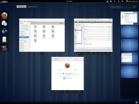
I'm in the minority with this opinion, but I think Gnome 3 is a very exciting desktop for the Linux environment. With the emergence of tablets and portable devices, it is time we got away from designing every Linux distro to look like Windows. Gnome 3 is tailored for the mobile/tablet user.
I personally haven't had any problems using Gnome 3 for business or productivity (as I have heard from the reviewers). I just think that they are having a hard time adjusting to the task management. Once you get the keyboard shortcuts down, you'll appreciate the layout. I like how easy it is to customize and change desktops. One major problem people have with technology (and the same could be said of everything really) they are unwilling to try something new and give it a chance. After all, at one point the Windows Start Menu was considered to far reaching. Now it's the standard. Things come and go; we must adjust to the changes.
My advice is to give Gnome 3 a chance.
